

Accessible mobile entertainment in Kenya should remain easy to use on an ordinary smartphone. People searching for online casino Kenya options may compare the content first, yet the interface also affects whether a user can read a stake, correct an error, or leave a session without confusion.
Accessibility matters beyond permanent disability. Similar barriers appear when someone holds a phone with one hand on a bus or reads the screen outdoors.
This article explains how to test a mobile entertainment service using settings already built into the phone.
Why Accessibility Matters on a Small Screen
A desktop layout can fail once compressed onto a phone. Text may become too small, while important information disappears behind an icon.
Good mobile design keeps the main action visible and gives the user enough time to understand it. The service should also keep working when text is enlarged or the screen rotates.
The Web Content Accessibility Guidelines, known as WCAG, provide a useful benchmark. WCAG 2.2 says ordinary text should be resizable up to 200% without losing content or functionality. It also expects content to reflow so users do not need to scroll sideways for every line.
The same standards improve ordinary mobile use. Clear controls help in a moving vehicle, while strong contrast helps outdoors.
Features That Make Mobile Entertainment Easier to Use
Small interface problems often appear only after the user changes a phone setting or uses the service in less-than-ideal conditions. The checks below show whether the platform stays clear and manageable when the screen is.
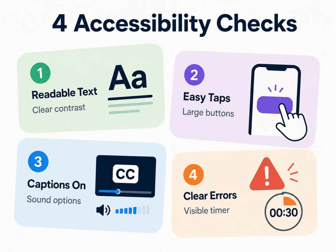
Readable Text and Clear Contrast
Increase the phone’s text size before opening the service. Menus and form labels should grow without overlapping or disappearing. Important information placed inside an image is harder to adjust.
WCAG uses a minimum contrast ratio of 4.5:1 for ordinary text and 3:1 for large text. An outdoor test can reveal grey text that becomes unreadable against a pale background.
Pay special attention to numbers. The balance and full stake should remain clear when screen brightness is reduced.
Controls That Are Easy to Tap
Small icons create mistakes when they sit close together. WCAG 2.2 sets a minimum target size of 24 by 24 CSS pixels, with limited exceptions. Larger targets may still be better for important actions.
Try using the interface with one thumb. The main controls should respond without requiring a precise tap. Actions with different consequences should not look almost identical.
For paid gaming, check the increase-bet control. It should not sit so close to the play button that an accidental touch changes the amount.
Captions and Flexible Audio
Entertainment should remain understandable when the phone is muted. The prerecorded video should include captions for dialogue and meaningful sounds. WCAG also covers synchronized captions for live video.
Check whether captions can be switched on before playback. For games, an important event should have a visual cue instead of relying on sound alone.
Separate volume controls also help when background music competes with spoken instructions.
Clear Errors and Enough Time
An error message should explain what needs to change. “Phone number must include the country code” is more useful than “Something went wrong.”
Forms should keep the information already entered when one field needs correction. Timed actions need a visible countdown and a clear result when the timer ends. WCAG includes timing controls because short limits can prevent users from reading or responding in time.
Run a Five-Minute Accessibility Test
A short test can reveal problems before the platform becomes part of a routine.
- Increase the system text size. Check whether the menus still fit.
- Mute the phone. See whether essential information remains visible.
- Use one hand. Try the main controls without accidental taps.
- Rotate the screen. Check portrait and landscape modes.
- Create a harmless form error. Leave one required field empty.
- Switch apps and return. See whether the current page is preserved.
Use the device that will actually run the service, since results can vary between phones.
Common Barriers and Better Design
Accessibility problems are often easy to spot once the interface is tested under real conditions. The table below pairs common barriers with a better design choice and a simple way to check it.
| Common barrier | Better feature | Quick test |
| Text stays tiny | Scalable text and reflow | Increase text size |
| Controls sit too close | Larger tap areas | Use one thumb |
| Information uses sound only | Captions or visual alerts | Mute the phone |
| Error message is vague | Field-specific instruction | Submit an incomplete form |
| Timer ends without warning | Visible countdown | Wait for a timed action |
| Colour carries the meaning | Text or icons beside colour | Turn on greyscale |
Color should support meaning, not carry it alone. A red status can also include “failed,” while a green result can include “completed.” This helps when color differences are difficult to distinguish.
Use the Phone’s Built-In Accessibility Tools
Android and iPhone include tools that can expose weaknesses in a platform.
Android Accessibility Suite includes TalkBack, Select to Speak, Switch Access, and the Accessibility Menu. TalkBack reads interface elements aloud, while magnification can enlarge the full screen or part of it.
On iPhone, users can enlarge text and turn on Display Zoom. VoiceOver describes screen content and supports navigation through gestures.
A quick screen-reader check can expose buttons announced only as “unlabelled.”
What to Check Before a Paid Session
Accessibility matters more when the interface handles money. The complete amount should remain visible before confirmation.
Check that:
- The total stake appears beside the main control;
- Deposit and withdrawal actions look different;
- The confirmation page repeats the amount;
- Transaction history remains readable after text enlargement;
- Leaving the session does not trigger an extra action.
A payment status should appear in words, not only as a color. The user should be able to return to the transaction later and understand what happened.
Conclusion
Accessible mobile entertainment works across different phones and real-world conditions. Text should scale, controls should be easy to tap, and audio should have a visible alternative.
Test the interface before spending money or starting a subscription. A few changes to the phone settings can show whether the platform adapts to the user.
FAQ
Does increasing the phone’s text size affect every app?
Only services that support scalable text will respond properly. Fixed text may remain small or overlap other elements.
Are captions useful when the user can hear normally?
Yes. They help in noisy places and when the phone must stay muted.
What is a screen reader?
It speaks interface content and supports navigation through gestures. TalkBack is built into Android, while VoiceOver is available on iPhone.
Why are large buttons important?
They reduce accidental taps and make one-handed use easier.
Should a countdown always be removable?
Some activities depend on a fixed limit. The platform should still show the remaining time and explain what happens next.